I'm Dale Cyrus D. Edrosalan, a third-year BSCS student at Gordon College in Olongapo City, Zambales.
I keep a Dean's List standing and I'm an OWWA EDSP scholar, so I take my studies seriously and like to see things through.
I enjoy both sides of building software: designing how something looks and feels, then writing the code that makes it work.
Outside of class I play Roblox, Valorant, and Mobile Legends, and I watch anime. Gaming is where a lot of my side projects start, from Roblox scripts to Blender models.
What I do
Apps and websites: I build mobile and web apps end to end, from the database to the screens people tap.
Games: I script NPC and boss AI pathfinding for Roblox games in Lua.
3D and graphics: I model characters, weapons, and structures in Blender and SketchUp, and design graphics in Illustrator, Figma, and Canva.
Hardware and networks: I repair PCs and laptops, set up networks, and hold TESDA NC II in Computer Systems Servicing.
Highlights
Education
BSCS, third year, Gordon College (ongoing)
Senior High School valedictorian, COMTEQ Computer and Business College, class of 2024
Honors
Consistent Dean's Lister
OWWA EDSP Scholar
Certifications
TESDA NC III and NC II, Fortinet NSE 1, and four Cisco Networking Academy courses.
At a glance
Experience
On-the-job training at New Cabalan National High School
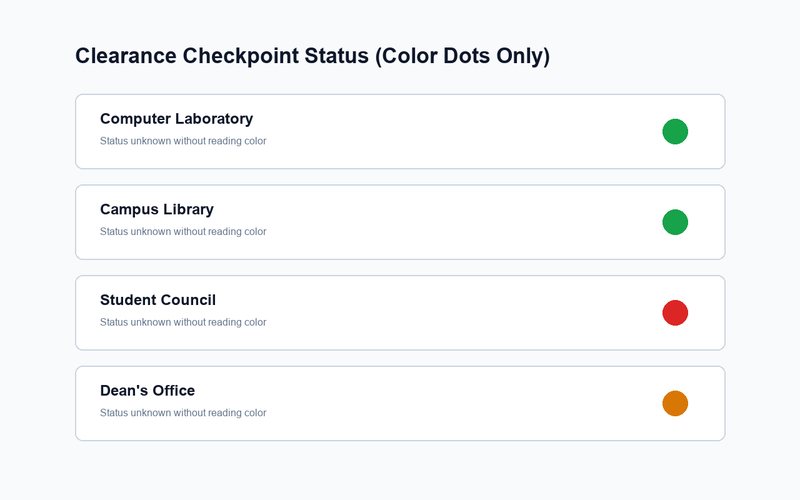
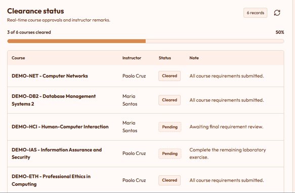
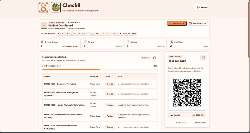
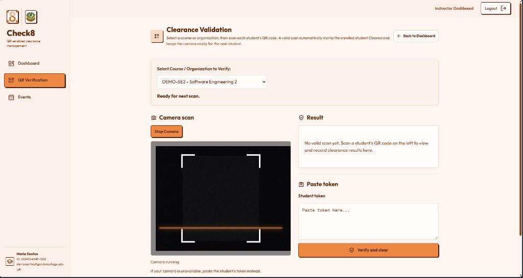
Check8 is a web-based QR clearance portal for Gordon College Computer Science students. It replaces paper clearance slips with online tracking: students check their pending items on their phone and clear each station with one scan.
Target users
Gordon College CCS students, lab staff, library personnel, student council officers, and faculty signatories.
Project duration
April 2026 to November 2026.
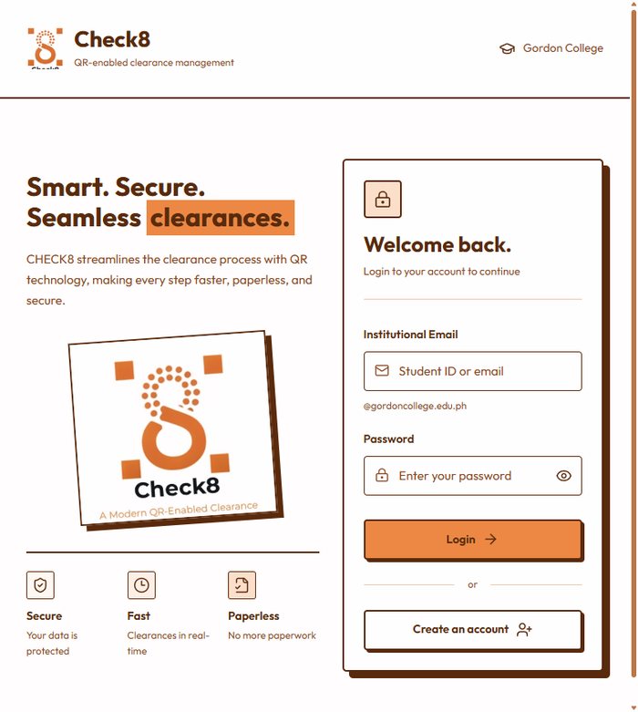
The Check8 sign-in screen.
The problem
Every semester, students wait in long lines for paper signatures, and losing the slip forces them to start over.
The goal
Show cleared and pending stations on one phone screen, with a scannable QR pass for fast sign-offs.
The team and my role
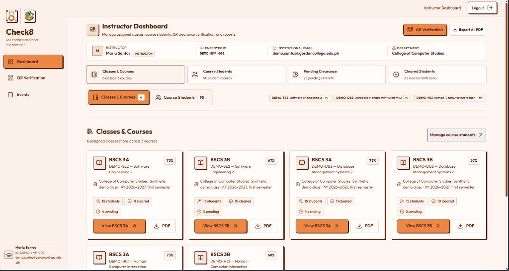
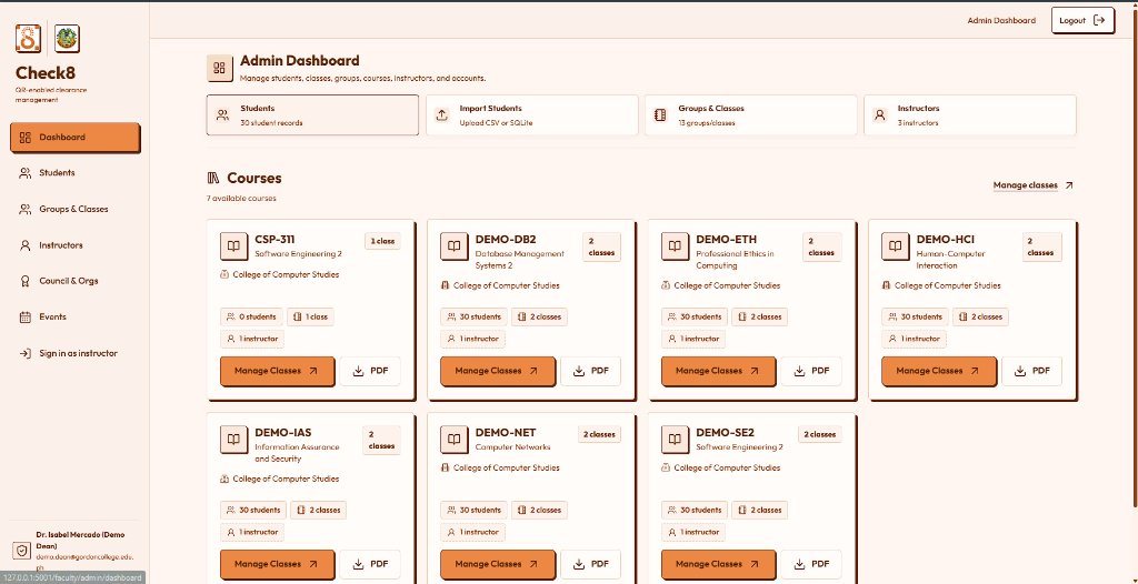
Implementation Lead (me)I led the build of the app: the clearance workflows, the QR pass and verification, and the student, instructor, and admin dashboards, and I kept the code in our shared team repo working together.
Requirements and Documentation Lead (me)I turned the clearance process at the labs, library, council, and dean's office into clear requirements and user flows, and wrote the project documentation.
Project ManagerGian Karlo C. Reguindin planned the work, set priorities, and kept the team on schedule.
JavaScript
Node.js
Express
HTML5 and CSS3
QR Code API
Figma
Understanding the user
User research summary
We interviewed 6 BSCS students and 2 office staff. Students could not see which items were still missing, and staff disliked looking up records by hand in binders.
Pain points
1. Waiting in line blindStudents wait 30 minutes before learning an item is missing, so the office checklist sits front and center.
2. Lost paper slipsPaper forms tear or go missing during finals week. An online QR pass can't be lost.
3. Vague "Pending" labelsUnexplained holds confuse students, so a short instructor note sits beside each pending item.
4. Slow record lookupsChecking paper lists wastes staff time, so live QR scanning comes with a manual Student ID lookup.
Persona and problem statement
Marco Reyes, 21 (an illustrative persona based on our target users)
Who: a graduating 4th-year BSCS student from Olongapo City and the eldest sibling supporting his family.
Goals: see every clearance station on one phone screen, show a scannable QR pass for quick sign-offs, and know why a station is pending before lining up.
Frustrations: crumpled or lost paper slips, waiting in line before finding out something is missing, and not knowing which office is holding up his clearance.
Quote: "Chasing paper signatures across campus during finals week wastes hours when nobody tells you what's missing."
Marco is a 4th-year BSCS student who needs online clearance tracking and QR sign-offs because paper slips get lost and waiting in line without knowing what's missing wastes his study time.
User journey map
Checks his statusOpens Check8 to see which offices are left. Unsure which desk to visit first.Opportunity: clear notes beside each pending item.
Walks to the deskHeads to the lab or office through crowded finals-week hallways.Opportunity: obvious Cleared and Pending badges.
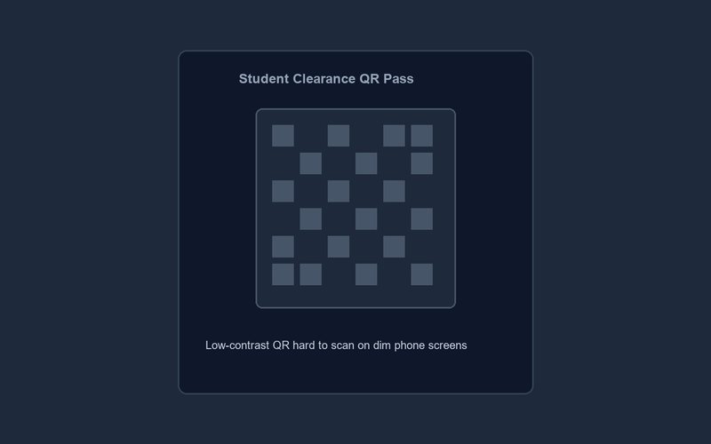
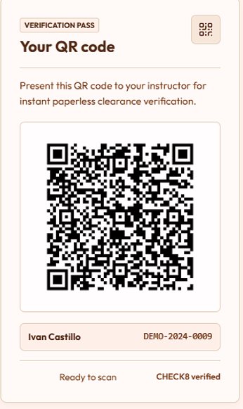
Shows his QR passExpects a quick scan, but dim phone screens make scanners struggle.Opportunity: a high-contrast white card around the QR.
Gets clearedRelieved, but wonders when the approval went through.Opportunity: a date and time stamp on every sign-off.
Starting the design
Paper wireframes
Our first sketches split the app into two sides: a mobile Student Clearance Pass and a focused Officer Verification Screen.
Low-fidelity prototype
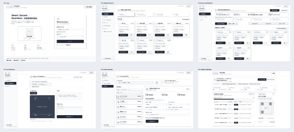
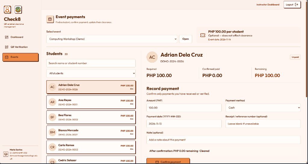
A six-screen flow in Figma: Login, Student Dashboard, Instructor Dashboard, QR Verification, Event Payments, and Admin Dashboard.
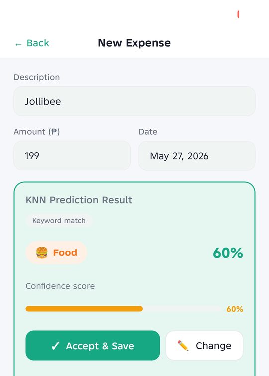
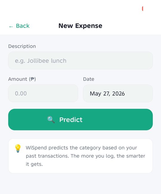
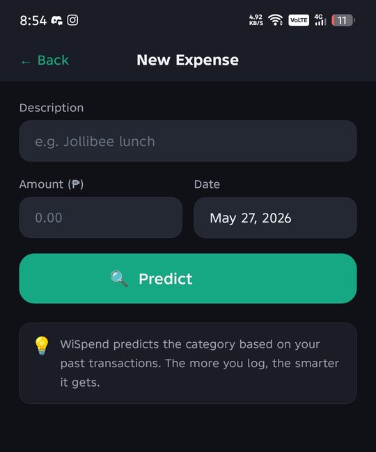
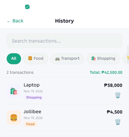
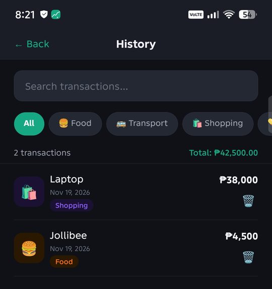
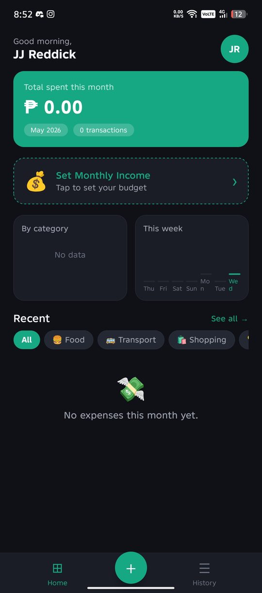
WiSpend is an offline-first Android expense tracker built with React Native. You type what you bought and how much, and a K-Nearest Neighbors (KNN) model suggests the category from your own past spending, with a confidence score you can accept or change.
It is made for students on an allowance, young professionals, and low-income earners who want to see where their money goes without linking a bank account.
Project duration
April to May 2026, in seven one-week sprints.
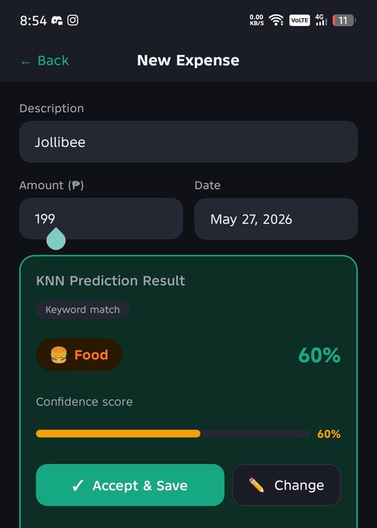
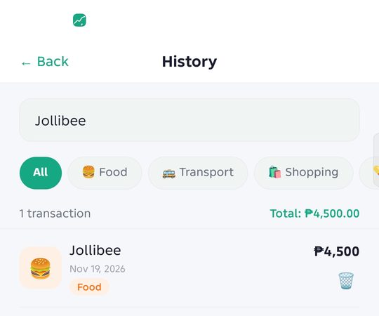
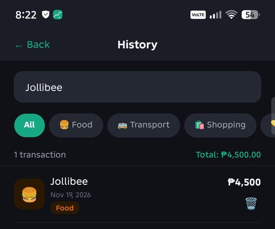
The KNN prediction in light and dark mode.
The problem
Logging every expense by hand is slow, and sorting each one into a category is tedious, so most people quit within weeks. Nothing warns them before their money runs out.
The goal
Make logging take seconds, sort expenses automatically while showing why, warn users before the budget runs out, and keep their data private and usable offline.
My role
Solo designer and developer for CSC221A/L Application Development and Emerging Technologies at Gordon College, AY 2025-2026.
Responsibilities
User research, wireframes and mockups in Figma, the React Native app, the KNN engine, the SQLite database design, the Node.js and Express backend on Railway, testing, and documentation.
React Native (Expo)
SQLite
KNN algorithm
Node.js
Express
Railway
Figma
Understanding the user
User research summary
I planned a five-question survey and three short interviews around how people track spending today and what makes them stop. Going in, I assumed users mainly wanted charts. The research pointed somewhere else: speed of logging and being able to trust and correct the automatic category mattered more.
Note: the interview responses below are sample responses I wrote to test the survey and plan the design. They are not answers from real participants.
Sample response 1"If I just type what I bought and the app figures out the rest, I'd probably use it more."
Sample response 2"If I could just log something in under 30 seconds, that would be ideal. Speed is everything for me."
Sample response 3"If the confidence score is shown and I can override it, then yes, I'd trust it."
Pain points
1. Logging is slowTrackers that ask for too many fields get abandoned. WiSpend asks for three: description, amount, and date.
2. Sorting is tediousPicking a category for every expense is a chore. The KNN model suggests one with a single tap to accept.
3. Hard to trust automationA guess with no explanation feels risky. Every prediction shows a confidence score and a Change button.
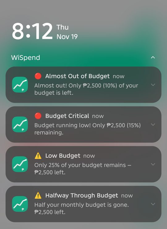
4. No early warningPeople only notice overspending at the end of the month. WiSpend sends alerts as the budget runs low.
Persona and problem statement
Bea, 20 (a fictional persona based on the target users)
Who: a BSIT student in Olongapo living on a weekly allowance.
Goals: know where her money goes and make it last until the next allowance.
Frustrations: trackers that take too long, apps that want her bank account, and finding out too late that she overspent.
Bea is a college student on a weekly allowance who needs a fast way to log and sort her spending because she gives up on trackers that take more than a few seconds to use.
User journey map
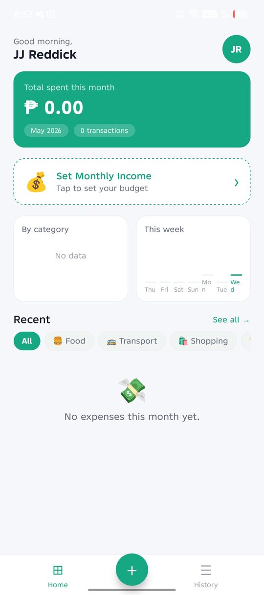
Buys lunchWants to log it before she forgets.Opportunity: one tap to start from the dashboard.
Logs the expenseTypes "Jollibee" and the amount.Opportunity: only three fields.
Sees the predictionUnsure if the app guessed right.Opportunity: show the category and confidence.
Saves itRelieved it took seconds.Opportunity: Accept and Save in one tap.
Checks her budgetWorried about the rest of the month.Opportunity: alerts before the money runs out.
Starting the design
Wireframes
I sketched the wireframes directly in Figma on April 1 and 2, 2026, starting with the four screens users visit most: Login, Dashboard, Add Expense, and History. I kept Add Expense to a single screen so logging never takes more than one step, and put the prediction right under the form so users see the result without scrolling.
If there is no past data yet, the user picks the category by hand, and the model learns from it.
How the KNN works
The description is matched against a keyword dictionary for each category.
The amount is compared against the user's own spending history.
The app measures how close the new expense is to every past one.
The three closest past expenses vote on the category.
The share of votes that agree becomes the confidence score.
Usability study: findings
I ran two rounds of testing on an Android phone. Each round had one tester, and both asked to stay anonymous.
Round 1: classmate tester
The Terms of Service felt alarming, with red warning boxes stacked everywhere.
The UID warning needed to be clearer at the moment users receive their UID.
The overall interface needed a cleaner look.
Round 2: mentor tester
Nothing warned users once they spent more than their budget.
The graphs and categories needed to be easier to read.
One fixed income was awkward. Users needed a monthly income plus a way to add extra income such as gifts.
Refining the design
Mockups: before and after the usability study
Round 1 change: I rewrote the Terms of Service as plain numbered sections and moved the strong warnings to the UID screen, right after sign-up, where users actually need them.
Terms of Service
🔐 YOUR ACCOUNT UID: CRITICAL INFORMATION❌ WiSpend CANNOT retrieve your UID❌ No email recovery, no support reset❌ Losing it means permanent loss✅ Write it down on paper✅ Take a screenshot immediately
🚫 NEVER SHARE YOUR UID WITH ANYONE🚫 Never share it in messages or chats🚫 WiSpend staff will NEVER ask for it
Before: warnings crowded the terms. Recreated from the original code.
Terms of Service
1. Acceptance of TermsBy creating an account you agree to these terms.
2. Account and CredentialsKeep your username, password, and UID secure.
3. Account UID and RecoveryYour 9-digit UID is the only way to recover your account. Never share it.
4. Data and PrivacyYour data stays on your device.
Scroll to the bottom to agree
After: plain numbered sections, with the UID explained as section 3. Recreated from the final code.
⚠️ IMPORTANT: read before continuing
YOUR ACCOUNT UID123-456-789
🚨 The ONLY way to recover your accountSave it now. WiSpend cannot recover it for you.
🚫 NEVER SHARE YOUR UIDWiSpend staff will never ask for it.
☑ I have saved my UID
Continue
After: the strong warnings now appear on the UID screen right after sign-up. Recreated from the final code; the UID is an example.
Round 2 changes: budget alerts now cover the whole month, the income setup has a monthly income plus extra income, and the categories got clearer labels and summaries.
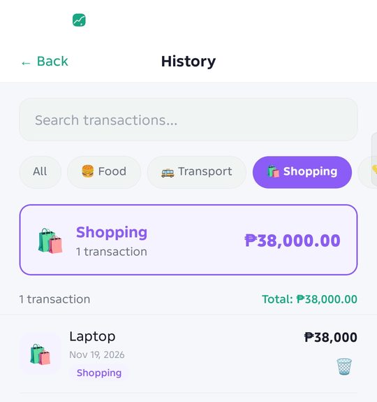
Budget alerts fire at 50%, 25%, 15%, and 10% left. One large test purchase crossed several thresholds at once, so each alert fired, once per threshold for the month.The dashboard asks for a monthly income first. Extra income, like gifts, is added separately.Picking a category shows a summary card with the count and total.
Main mockups
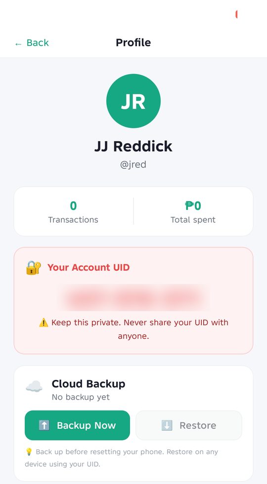
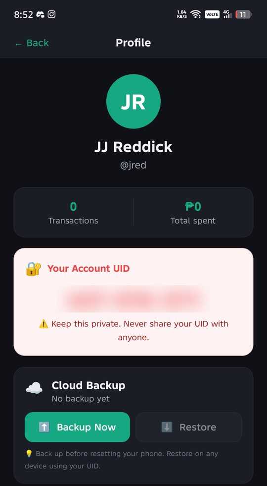
Add expenseHistorySearchProfile and cloud backup (UID blurred)DashboardKNN prediction
High-fidelity prototype
The high-fidelity mockups were finished in Figma in both light and dark mode by April 7, 2026, then built as the working Android app.
1. Not color aloneThe confidence score is shown as a number and a bar, and every category has an icon and a text label, so no meaning depends on color.
2. Light and dark modeEvery screen works in both themes, and the choice is saved between sessions for comfortable use at night.
3. Clear words and big targetsLarge, labeled buttons like Accept and Save, and alerts that state the exact amount left in plain language.
Takeaways
Impact
"Out of all the students that presented us an app regarding finances that are similar to WiSpend, your project stands out and is the best one I've reviewed."Panel reviewer
What I learned
Where a warning appears matters as much as what it says. The same UID warning felt scary in the terms and helpful on the UID screen.
Showing why the model guessed a category builds trust, so users accept good guesses and fix the rest.
Designing local-first made the app reliable even without internet, which also made demos safer.
Setting up a shared theme early would have made dark mode much faster to add across all screens.
Hosting details, like Railway clearing files on restart, need planning before launch.
Next steps
1. Recurring expensesTemplates for things paid every month, like load or rent, so they log themselves.
2. Month-to-month trendsCompare spending across months so users can see if they are improving.
3. Smarter predictionsA larger Filipino keyword dictionary so new accounts get accurate categories sooner.
Most of my game dev work was sold to clients, and my agreements don't allow me to share it publicly, so I can only describe it here. I'm happy to walk through my process in an interview.
Roblox NPC and boss pathfinding
AI pathfinding for NPCs and bosses in Roblox games, written in Lua, so enemies can find routes around obstacles and chase or patrol the player.
Game-ready 3D models
Character models, weapon models, and structures made in Blender and SketchUp for use in games.
Character animation
Combat animations for Roblox characters, like this dash with after-images that trail behind the character to show speed.
A dash animation with after-images, made in Roblox Studio.